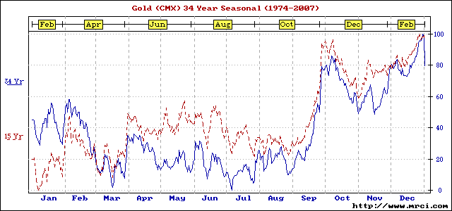
This chart shows the historical relative strength and weakness of gold during different months. The Blue line represents 34 years worth of data and the Red line represents 15 years worth of data. The point being that we are in the weakest part of the year now, but soon to move into the strongest part of the year...
I heard it was "sell in may and walk away" but the chart appears to have the dip more around feb/march.
Thanks for the chart, man I wish I knew more!
The silver [is] mine, and the gold [is] mine, saith the LORD of hosts. Hag 2:8 [/b] He created it. He controls it. He gave it to us for His use. Why did we turn from sound scriptural currency that PROTECTS us?